top of page
meggy laguda
fine tuning
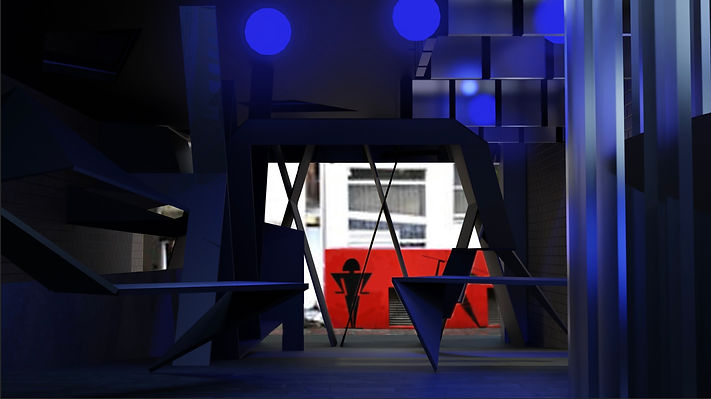
After considering adding light projections, I have photoshopped in light projections of the site sequence which adds texture and dimension to the welded steel-matte finished forms

You can see on the benches that the site sequence images have been projected and that I've added in blue ambience lighting to the space. I thought that perhaps this blue light would serve as making the site look like you are walking in the night time and increase that sense of inherent paranoia.
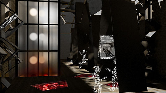
However, the blue seemed to calming. I researched which colour brought out the most anxiety- red was the answer while blue is seen to be the most calming colour. Red has an intenseness to it so I decided the redo this lighting.
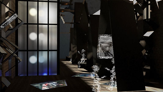
The transition from downstairs to the upstairs that was discussed in previous weeks, I decided to showcase the slow but clear transition of hierarchy between the two floors through the lighting fixtures in the light wells.
Creating a gradient from the intense downstairs colour, up to the clear white light upstairs, though through the glass floor details, visitors are still given glimpses of the intense light which dwells with the public below them.
bottom of page